
Thursday, 23 April 2015
OUGD402 PPP Design Strategy Presentation
Studio Brief 3 - Design Strategy Presentation
| Module ID: | OUGD402 | Module Brief: | Click Here |
| Module Leader: | Simon Harrison | Module Deadline: | 23/04/2015 (09:30) |
| Brief Deadline: | 23/04/2015 (09:30) | Outcomes Assessed: | 4A3, 4B2, 4C2, 4D2 |
Studio Brief
| Produce and present a 7 minute Powerpoint/pdf presentation that communicates a reflective summary of your experiences on the course to date. You should aim to reflect on who you are as a learner and a designer as well as how the things you have experienced over the past nine months have affected your current aims and ambitions. You should also identify creative concerns, personal aims and professional ambitions that you intend to explore further over the Summer and during Level 5 of the programme |
Background / Considerations
| Your own personal development as an individual and as a designer is affected by all aspects of your life. This is an opportunity to reflect on the experiences from the past nine months that have informed the decisions that you have made/are making about your future development. The ability to reflect upon your personal development can help you to gain confidence in your abilities as well as identify areas of strength, focus, ambition and improvement. What have you learned and what do you want to learn? What mistakes have you made and how have you learned from them? How will this affect your future development? What are your strengths and how have you/will you develop them further? What are your weaknesses and how do you intend to address these? What have you enjoyed and why? What have you disliked and why? How does this affect your ambitions? What did you want to get from the year? Have you achieved this? What have you discovered that you weren’t expecting? |
Mandatory Requirements
Your presentation should last 7 minutes and allow 3 minutes for questions to be asked (you will be penalised for a presentation that is shorter or longer than this).
Although the content, tone and conclusions of this reflective process should reflect your own experiences, personality and ambitions, you should aim to focus on the learning journey and how this has informed the decisions that you are making about your future. To this end you should use examples of your own work, creative skills and interest in the contemporary field of design as part of your presentation.
You should be prepared to answer question on your presentation posed by your colleagues |
Deliverables
| 1 x 7 minute Powerpoint presentation. Evidence of critical engagement with personally relevant contemporary design practice in the form of a blog. PDF of presentation slides. |


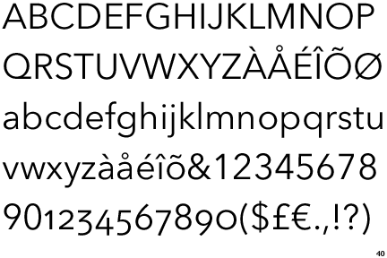
and here is the grid structure that I have used for all of my PPP Presentations…
Tuesday, 21 April 2015
PPP Studio Brief 2 - Self Branding
For this second part of the PPP module we were brief on the second studio brief and here it is...
Studio Brief 2 - Self Branding
| Module ID: | OUGD402 | Module Brief: | Click Here |
| Module Leader: | Simon Harrison | Module Deadline: | 23/04/2015 (09:30) |
| Brief Deadline: | 19/03/2015 (09:30) | Outcomes Assessed: | 4A3, 4B2, 4C2, 4D2 |
Studio Brief
| Design, develop and produce self branding that effectively communicates and promotes you as an individual, designer and learner. To inform your design decisions you should reflect upon your learning aspirations and design direction. You should aim to communicate the context of your interests by referencing specific designers, studios, principles and audiences where necessary. You should use this brief as an opportunity to explore, develop and demonstrate content, processes and areas of design that interest you at this point in time and may indicate your emerging creative concerns in Graphic Design. |
Background / Considerations
Your resolution to this brief should be a representation of what YOU see as important as an individual designer and learner in light of what you have learned on the programme to date. You will need to consider the following:
Who are you now? What have you learned? What skills do you have? What do you know? What do you believe? In answering these questions remember that your design practice is informaed by a broad range of social, ethical, creative and professional concerns. What are they.
What information do you need to include? and what formats can you use to effectively communicate or promote this information? What tone of voice best reflects you, your practice anf your ambitions?
What experiences have shaped your opinions and views both in and outside of te programme?
What are your creative concerns, opinions and beliefs and how do you communicate these practically, conceptually a practically? Wht has informed these decsions and who are the contextual references that reflect your individual focus?
What is 'Brand You'? Your visual identity will help tie the information together. What fonts, formats, colours and production methods will help communicate and enhance your content.
|
Mandatory Requirements
| All work should be evidenced through your PPP blog. Resolution should form part of Studio Brief 03 - Design Strategy Presentation. Final resolution shouid be presented on design sheets, which document your research and design decisions. |
Deliverables
Fully resolved self branding, including but not limited to:
A logotype/symbol Colour swatch Typeface (display and body copy) Presentation template (grid) This should be developed with reference and relevance to your own creative practice.
Evidence of practical, conceptual and contextula research into materials, formats and content.
So we were briefed on the this unit and initially this seemed like not only it was going to be very fun to complete but it is actually something of which I have been waiting to do. For a long time now I have contemplated on branding my self as a graphic designer as without this how do I expect to get any work from the outside world, so finally my plans were coming together. This unit would help me benefit in a number of way from the actual designing of my own logo of which I have previously attempted and failed every time to the fact that I would have to take into context a lot of things, what I think is necessary for me to have as part of my branding? and to having to think about what the branding will look like and really think about stock choices as the moment that I hand this card over to a perspective employer their first impression about me would be made instantly! and this is why it is so important! I started off the idea generating stage for this unit by creating a mind map of in which I discussed firstly all of the elements of which I thought I needed to complete my self-branding but also I decided that I would design my branding by a possibility two ways, and these two ways are two way of which I would like to be perceived when I hand over that card with my logo on it. The first of these ways is as a corporate sense to myself, efficient, clean, sharp, a perfectionist and the other way that I thought I could brand my style would be the fun, outgoing, exciting and expressive side to myself. For the first of the styles I started by sketching out some mock idea's for logo's that fit this style using imagery of which I thought fit this style, one symbol that I really liked using in the creation of these was the shield as for me this symbol stands for strength and persistence, and when coupled with an eye for design this style was screaming strength and perfectionist of which I really liked. With this style I decided it would be most fitting to make a logo of which relates to me in some way. Furthermore I also started sketching out some quick ideas for the more light-hearted avenue of which I could have took in the design of my self branding. With this way I wanted to display the arty side to me through the branding , I started including the use of circles into the design process as to me in a logo, due to the lack of sharp edges and angles they scream friendliness and approachable of which are two very important parts of the way I would like to be perceived. For this avenue I could have gone down I instead of creating a logo for myself was going to create a logo style piece including my name in a chosen typeface and then couple the text with some sort of illustration of which is linked to me as a person, so I then started sketching some small illustrations of art related products and then also outlined two more areas of my personality of which I could work with in the illustrations.    For the first part of my research for this unit I have decided too look at four different logos of which I found and took inspiration from, two of which first the first corporate and clean style I was looking for and two of which are more fitting to the latter more creative and fun side to myself that I wanted to display.  
The first two images seen about are two examples of the first avenue of style of which I could go in when designing my logo. These both pit perfectly in to what I would want my style to be, they are the sort of logos of which could be seen used by massive companies across the world. I really like their black and white nature and this then coupled with the clean and sharp feel that they give off this all come together in my eyes to display a sense of elegance and classiness that I would like my logo to display. In both cases they also hit a criteria of which I would really like for my design too, they both as are the type of logo of which even standalone with no accompanying text at all could be easily recognised, and in that way they speak volumes, at the first hurdle this style of clean and efficient design is the way I'm tending towards.
 
Furthermore these last two logos out of the four were my inspiration four the other more arty side to my persona of which I could display through my self branding. Honestly they are not so dis-similar to the first two logos but the differences change the perception of the logos massively, the more cursive mature of the logos that comes from the fact that the lines are curved and points are rounded adds a much more approachable and friendly sense to them of which is exactly what I would want if I chose to design my logos in this style. The further addition of colour to take it away from the monochrome also adds to this more expressive and more adventurous style and almost adds a somewhat illustrative sense to the work.
After thinking about my research and then having a little more play with the sketches of two different style I finally decided that I would take into my final outcome for this module the first style as although yes I am adventurous and expressive, this should be more than apparent by the fact that I actually am a graphic designer, instead through my self branding for me as a graphic designer I wanted to display the sense of clean, sharp and professional style to myself that I think I have.
For the next part of my research as although the logo is what I believe is the crucial part of this whole branding identity brief. the logo alone will not be what I will give to prospective clients, and so therefore the business card I believe along side the logo is the most important part of this whole branding project, the moment that I hand over my business card the potential clients will be making judgements about me from the business card from the word go.

This first business card above fits perfectly into what I want my branding and business card to look like. It gives off through the use of minimal colour although in my final I definitely want to add some sort of colour to it, a massive sense of cleanliness and professionalism. Its minimal style couple with sharp graphics and clean type gives off the corporate image that I would like my business card to give off.
 
These next two business cards above I took inspiration from not from the style or shape of the business card but from its inclusion of extra techniques of which I could think about including in my business card. The first of the example has used de-bossing on the type and illustrations on the card to give the card that little something extra. The second of the cards uses a technique called foiling which is also something i could think of including. I looked at little techniques like these because I believe that the first impression given by the business card is the most important factor, as in that split second the little extra care and attention added could be the deciding factor to a potential client choosing you over any other graphic designer.
 
These final two business cards are two more examples of ways of which I could distinguish myself from the crowd of all the other graphic designers in the world, that little something to get me noticed but this time it isn't through the use of extra techniques but it actually instead just a minor change to the shape of a usual business card, little steps lie this can go a very long way in making you stand out and possibly getting myself chosen over anyone else competing for a certain job.

I then scanned in my sketched for logo's that I had done and started digitalising some of them. I started designing making sure that I managed to stick with the sharp, clean and professional aesthetic that I was looking for in my logo. I began by combining in my logo the use of my initials as this is what I wanted the whole basis of my logo to revolve around, what relates to me more than the initials of my name? along side the use of these initials I started incorporating some aspect of which i wanted to include the first of these being some sort of solid structure in the logo such as the shield and box shapes seen above in my designs. I started used this method as through my logo I wanted to display structure, strength and uniformity(organisation) as this was a part of my logo that I would very like my prospective clients to pick up on. I liked the first of my logo's seen above but the plain use of just my initials and the shield shape just wasn't enough for me so then I started experimenting with a slightly more abstract method still incorporating the meaning I was trying to display but in a slightly less obvious way, working with a lot go geometric shapes and straight lines. Finally I came up with the last of the of the logo's seen above of which I thought was the best of the lot, it perfectly incorporated the feeling I was trying to display through my logo but also incorporated my initials quite well, they weren't too obvious but I thought they were clearly there to be seen but it still wasn't quite there in my eyes.
I then took these five designs into the first crit for the unit and displayed them to my peers and ran them through the thought process behind why I had designed them in the way I had and explained what I was looking for in my logo. The groups reaction to the designs was very similar to my own by far the favourite of the group of logo designs was the last one but although it was the favourite it still received a lot of comments about the fact that although it looks nicely designed the initials of my name are a little too distant and if you didn't know my name already you wouldn't see them. I was happy with this crit feedback as this was my favourite design but even I knew that it wasn't quite good enough so back to the drawing board I was to go, using this last logo as the initial inspiration for my final logo.
I started to play around with designing the final logo now and having decided that I wanted to create a logo of which was stand alone and although I would be choosing a font to go with it, it wouldn't be accompanying it in the logo it would just be connected as part of the overall branding and with some tweaks to the design my final logo was finished. I had kept all of the aspects of the last design of which I liked, the heavy rugged nature, strong structure and a slightly less obvious inclusion of my initials and had just re-arranged these to become what you see below.

We then organised a small crit between me and a fews of my classmates to discuss our final logo designs. The feedback that I got from this crit was much better than the last crit as they now thought that I had managed to achieve what I had set out to do having managed to incorporate all of the aspects of the design I want to so that it portrayed the wanted message to prospective clients such as the shield structure of which I went with as I believe it stands from strength and professionalism while just being able to include my initials in a way that is not completely overly obvious to the viewer and finally creating a clean and simple logo in the process.
It was now time to add my logo to and create my business card of which meant I then had come to the two final major decisions for the project what type families and what colours that I would include with my logo in my branding identity.
For the font choices I firstly decided that I would choose two different font families that I could use, one for and sort of Title/Heading/Important Info and one for the majority of text. For the title font I had to choose something of which would go with the heavy and thick nature of my font and seen as one of my favourite fonts at the moment worked perfectly with it I decided to use Gotham bold. Its sans-serif and bold/heavy nature both fits perfectly with my font as it gives off a clean and sleek look and a sense of structure. The next task was to choose a body copy text of which would fit well with the logo and the typeface already chosen. After a lot of nothing but trial and error I decided to use Avenir next, the main reason for the choosing of this font was the fact that It quite suited well matched with gotham bold as they are both fonts with smaller x heights of which makes them both quite rounded compared to most fonts.
Finally the last aspect I had to decide on before creating the business card was what colour choices I would use for my branding colour pallet, I decided that the colour I chose for my branding I wanted to be both calm and quite neutral. I decided on this as I believe these neutral colours are what is the expected and what goes very well with the classy elegant and professional style of design i was going for and also the fact that I don't want the prospective clients to think I specialise in certain colours so therefore so that I could still include colour in my branding as I wanted a neutral colour was the best Idea. So therefore to accompany the black and white after more trial and error I decided upon using two different cream shades, a darker and a lighter one.
 
Now that all of this was decided It them meant it was tim to put together my final business card and here it is. For my final business card I made a strict grid structure that my business card would all be designed around top ensure that it remains professional looking. After trial and error with placements of the aspects of my business card and addition of other needed information my business card was finished. As a little extra addition to my cards I planned to de-boss a scaled up version of my logo on the card so that it would be only slightly apparent by view and not overly in your face but due to met lack of time and resources to do this with I decided instead to include this scaled up logo into my card by using the slightly darker cream colour so that It gave the aesthetic effect of a de-bossing causing shadow on the original colour but it meant it would have the extra sense of touch to it. If I would have had more time I would have definitely de-bossed this up scaled logo.Finally I then applied my logo, colour pallet and font choices for my self branding on to a photoshop collateral document so that I could see what the finalised branding would look like in a real life situation.

I am really happy with my final branding for this module as this is something I have wanted to do for a very long time and now it is done and I am very happy with it. There are a few little things I would change like the addition of something to make my business card stand out more such as de-bossing if I had more time but I am very happy with how it has gone.
|
PPP Studio Brief 1 - Reflective Practice
Studio Brief 1 - Reflective Practice
| Module ID: | OUGD402 | Module Brief: | Click Here |
| Module Leader: | Simon Harrison | Module Deadline: | 23/10/2014 (09:30) |
| Brief Deadline: | 23/10/2014 (09:30) | Outcomes Assessed: | 4A3, 4B2, 4C2, 4D2 |
Studio Brief
| Collect, categorise and reflect on a body of investigative research and creative references, which documents your ongoing development as a Graphic Designer and your engagement with contemporary creative culture via your PPP course blog. You should make regular posts to your blog that demonstrate an increasingly individual/independent exploration of Graphic Design, the broader creative industries and general visual culture. You should use this brief as a starting point for the development of an increasingly informed understanding of the nature of contemporary graphic design practice and its role in our local, national and international culture You will need to maintain an ongoing evaluation of your individual progress in Level 04 of the programme by regularly reflecting on what you have learned, how you have developed and how this relates to your own creative ambitions. As part of this process you should post copies of each End of Module Self-evaluation to your blog in order to maintain an ongoing recored of your reflective skills and analytical responses to your own development. Certain Tasks will be set and you will need to record your responses to them but you should use them as a starting point for your own independent research activities. |
Background / Considerations
| We are not asking you to simply produce a scrapbook of images or a day-to-day diary of what you have seen/where you have been. Keep your references broad by searching out new and interesting connections. Take the opportunity to attend lectures, events and exhibitions. Organise study visits to studios, galleries etc. and remember to record and reflect on all that you see. Set time aside on a regular basis to reflect on the work you have produced and its relation to your emerging creative interests and areas of individual focus. |
Mandatory Requirements
| All posts to your blog. should be labeled withe the module code and (where relevant) the appropriate Task number in line with the programme's naming conventions. All posts should be date stamped and supported by appropriate levels of self reflection, analysis and evaluation. Work should be referenced and sources should be acknowledged where appropriate. |
Deliverables
| Evidence of responses to set tasks independent research activities, personal reflection and ongoing evaluation demonstrated through regular postings to your PPP Course Blog. Inspirational Graphic Designers For this part of the brief I will discuss graphic designers of which inspire me but as this task is to start our thinking process about what sort of graphic designers we would lie to be and where we would like to work I have decided that I will only feature UK based graphic designers as I believe it would be more appropriate and realistic for my ambitions to get a placement at one of the studios. Catalogue Catalogue are a Leeds and London based graphic design studio of which was opened by Tom Pratt and Oliver Shaw in 2011. They produce work for both industry commissioned work but also for self-initiated work projects of their own. They have done work for a vast range of companies and organisations ranging from small independent companies such as the Belgrave music hall in leeds to multi million dollar/pound earning companies such as Pepsi and Urban Outfitters. Their works specialises in visual identity, art direction, wed design and development but personally the reason why I am so inspired by them is their work in printed matter that includes a lot of editorial design with photographic images and a wide use of typography. Their work has featured in many exhibitions across the world stretching from the UK, to Europe and to the USA.
Hungry Sandwich Club
Hungry Sandwich club are a graphic design practice that come from and are currently running based in Leeds, both of the graphic designers graduated with the BA Honours Graphic Design degree from this uni and that is why it make them so inspirational to me as when I was initially told about these designers I couldn't describe how much it filled me with confidence with the fact that someone so closely related to me myself at the moment is doing so well.
When this is coupled with the fact that they produce work of which I am very inspired by,working with animation, graphic design and illustration as a whole, their characterisation of their illustrations coupled with the heavy strokes and bright colour pallet creating an overall lighthearted but professional feel to them fits in perfectly with the style of work I have concentrated in creating for a long time.
Fieldwork
Fieldwork are a graphic design studio based in manchester of which don't specialise in a certain style of graphic design but are actually a lot more open in the sense of word. They create work in a range of different media starching from design work in websites, to commercial brand identity work, to work with digital products by helping big corporation to design bespoke applications and to finally any other aspect of the work of visual communication stretching from illustration, to photography, to videography and even print and editorial design.
As they are an up and coming studio they don't like to singularise themselves in to one area of work but prefer to refer to their work as these two things "Every project is deferent, but each one starts with a solid understanding of the context and finished with high attention to detail" and
"Learn - Together, we learn about your organisation and the project’s context, define goals, devise a high level strategy, and outline a scope of work.
Make - We prototype ideas, test elements of the project, figure out how the things we’re making will work as a larger system, and refine the successful parts.Deliver - We write code, finalise designs, test and deploy. Then we add that extra special shine before working out how best to launch the project for the most positive impact."
Magpie Studios
Magpie Studios are a design studio based in London, UK. They base their whole ethos around their statement "Ours is a simple approach; listen to out clients, understand their audience and solve their problems". They are a studio of which are more than happy to battle any brief that you may have stretching from a photographic black and white brief to a colourful vectorised design and all levels of the spectrum in-between and it is their colourful vector side of which I take massive inspiration from as it is a style that I have always liked to create and look at through my graphic designer years and is something that I massively inspire to do.

Sawdust
Sawdust are a multi award-winning graphic design studio based in London, UK created by Rob Gonzalez and Jonathan Quainton. They have been recognised and praised by many graphic design based journals, publications and magazines stretching from Creative Review, Its Nice That, Computer Arts and even D&AD. Their ethos is "Creating work with intelligence, visual integrity and meticulous craft is what drive us forward. The reason why I take massive inspiration from them stretches from what area of graphic design they produce work primarily for of which is a new like of mine only very recently is editorial design using typography, image making and visual identity to all come together to create the fantastic editorial design that they make.
Their client base includes massively corporations such as IBM, Coca Cola, Audi and many many more making them a very important character in the work of both UK and International graphic design.
 
The Design Surgery
Another design studio of which inspires me by with their work as a whole is The Design Surgery. They are a graphic design studio based in London, UK. The four areas of graphic design in which they specialise are editorial and web design of which includes design for web including specialist coding knowledge and e-marketing. Info-graphic design, brand identity and illustration of which they also apply to events management and design identity for events and canvas art and illustrations. Their ethos is " we
pride ourselves on our in-depth knowledge of visual communication, brand
awareness and targeted design. We examine the boundaries of our clients
requirements, revealing a brand's purpose and personality. By identifying the
role in which a brand should play, we are able to grasp an accurate
understanding of the links between business, brand and consumer. Design can
have a profound effect on how we feel both mentally and physically. By tapping
into the psychological responses to visual communication, we are able to reach
your clients at an unconscious level, creating a strong relationship between
your brand and your client."
Raw
Raw are a Manchester, UK based graphic design studio of which prefer to refer to themselves as a "Creative Agency". Their ethos is "We create effective pieces of
design and creative communications, with a focus on craftsmanship and
collaboration.
Ours is a
simple approach: we take the time to get to know our clients, we do all that we
can to understand the people they’re trying to reach, then we take what we know
and create memorable, relevant pieces of work. We look after the people we work
with and we like to think that we make the creative process enjoyable for
everyone involved." They have won a range of awards stretching from being included in the Creative Review Annual 2013 to the D&AD awards. The reason why I am so inspired by this studio comes from two things firstly the fact their work speaks volumes of everything Iike about graphic design a perfect balance between illustration design, web and app design to editorial design and even photography with all of their work displaying a sense of lightheartedness to willingness to try and a willingness to learn.

Foke
Foke are a Manchester, UK based graphic design studio and their whole ethos revolves around three P's;
"Propensity: “A
penchant for design with purpose.”
Based in
Manchester, Foke love to create well thought-out, balanced and cohesive graphic
design, from brand identity and development to packaging and promotional work.
Process: “People
will always tell you not to meddle in other peoples business”. Foke
love to meddle!...Stick our oar in, tinker with, re-arrange...and revamp. We
create shiny new things from this constant meddling
Personality: “Personality
goes a long way”. Foke was founded with a simple aim: to produce work with
personality, make it memorable."
Similarly to the last design studio raw, Foke share the same reasons to why they inspire me, not only the style of work that they create of which I am massively inspired from to the fact they are based so close to home and would be a perfect studio for me to gain some work experience with.
After looking at all of these UK based graphic design studios of which I am inspired by I have come to the conclusion that I will start email around and see if through emailing I could secure a place for a short internship of which would help me massively improve and further my graphic design knowledge and experience and I have decide due to the fact that I am home over summer that I will email the three manchester based studios Fieldwork, Raw and Foke to see if they would possibly offer me a short internship. As to gain this priceless experience just before the start of Level 5 would be a massive and helpful experience for me to have.
Drew Millward
Recently I went to the opening night of the DUST exhibition that was being showed at Colours May Vary of which was displaying the work of famous graphic designer and illustrator Drew Millward. Drew concentrated on creating his very own style of design of which incorporates aspects of illustration and graphic design and then couples this with a very post-modern approach using masses of design leaving little white space and the fact he used a range of vibrant colours in his design, even in the backgrounds leaving the majority of his work with no white on them at all to create a very interesting, inspiring and unique style of design to me. My inspiration for him originally come from seeing work of his of which he created for the brudenell social club of which is right next to where I live now and in seeing his work for them I decided that I would definitely have to see some more!
  
Leeds Print Festival
I also visited another local design based even called Leeds Print Festival as suggested by one of the tutors. I went to this as print was not initially a thing of which I was very inspired by but a lot of people are, at first I didn't really understand it, U used to be stuck in the mentality of why do physical printing when I could just digitally print it but these even changed my whole outlook on the design style. I was amazed by the work displayed during the event at the festival and inspired by the talks during the event and the panel discussions on the Saturday, it really was a celebration of all things printed. This event really opened my eyes to the world of physical painting techniques and massively multiplied my enthusiasm to experience what It is like to do.
Leading on from this new aspirations to try and become more developed in physical printing techniques I took a workshop in and experiences through the course screen printing, letterpress and mono print.
End Of Module Evaluations Design Principles
Overall I have found this module (Design Principles) very rewarding but also importantly very fun! This module made me take a big step in the advancement of many things, firstly Studio Brief 1 helped me by advancing my knowledge in a lot of graphic design area's of which I had not really thought a lot about such as colour theory and the use of negative space, these tasks enhanced my knowledge in these areas and then took me on two the second half of the module.
In preparation for the second brief of the module Studio Brief 2 we completed a range of task that also made me become more experienced and advanced my knowledge but this was not in a theoretical sense but in more of a physical means such as an insight in to fold only booklet methods and an introduction to book binding methods of which we would take on into the final outcome of the module. Finally with some help and practice into typesetting styles through another study task I was ready for the final stage.
The actual creating of my final book I thoroughly enjoyed, and it helped me to further my knowledge of a side of graphic design I am very interested in book/editorial design.
OUGD405
This module of work has been overall very helpful in my belief as all of the units have taught me something different of which I wasn’t used to but none the less all equally as valuable to my learning process.
I really enjoyed the first brief as it was left almost entirely open to us and therefore allowed for a lot of variation in the possibilities for ideas to take forward and therefore caused the creative side of me to start flowing.
The second unit I found very helpful as it further developed a side to be of which I believe is quite a lot behind the designing and practical side of me of which is research based work it helped me to develop the process I go through when getting research to base my work on and to manage my own time when research as we were left free to do this and weren’t guided through it.
The third unit I thoroughly enjoyed as this brief gave me an insight into a section of graphics design of which I am very much interested in but have never got to have a good go at in the past, and opened my eyes to new processes, this side to graphic design being an editorial side.
Finally the last unit also gave me an insight into another side of graphics of which was a look into branding for companies this was helpful as it helped me get an insight into a world of graphic design I had never looked into of which was branding and got me started on this side as an upcoming unit we will do for PPP will be branding so this may have prepared me.
Overall this whole module was helpful as I believe all of the brief helped me farther develop an area of graphic design of which I am not used to taking part in.
OUGD403
I have thoroughly enjoyed this first module of which is now coming to an end and I think it had been a great start to the course because I have really enjoyed the variation of the module in having to use various different skills to be able to complete the task. It has furthered the knowledge in subjects that I am experienced In but had also brought to light new skills of which I need to learn and improve and has made me start to do that. The first brief was a brilliant start to the course as I have always wanted to delve further into the theory and application of typography as I don't believe we looked at it in enough details in my previous qualifications. This unit was also a big help as it helped improve my hand drawing skills. The second unit also helped me improve my illustrator skills as I am too used to photoshop and need to learn to bridge out into other softwares and this helped me do this. The third unit was one unit of which I thought I was going to hate but actually as it developed it helped be realise the importance or researching skills and improved the way I do this and finally the fourth and final unit was something of which I already love to do and therefore I thoroughly enjoyed it. Overall between the four units I think this first module has been very good help in the improvement of my skills. My favourite brief was definitely brief four as the creation of posters is one of my favourite parts or graphic design and I thought the lead on from the research in brief three was a really good way to attack the brief. Throughout this unit I struggled getting my head around the blogging aspect to the course but it all come together nicely towards the end of the course as I realised that the best way to keep on top of the blog to little parts at a time. To end on a positive note I also thought the study tasks between studio briefs to get us prepared for what is to come is a great way to structure out workload.
For the modules after this I hope to keep on improving my skills within the subject and have learnt about a lot of processes I have used a bit and ant to use more or would like to use for the first time such as some of the more specialist equipment in the digital print resource. With this next module I will concentrate on keeping my attendance and punctuality at maximum and keep on top of my blog by writing little bits at a time so that I don't ever have to play catch up with it again.
PPP Overall I have found this module very exciting and helpful, the reason like this is because firstly it helped me with looking in to the real world of contemporary graphic design allowing me to reflect of my likes and dislikes in the world of graphic design and this then lead on to the fact that secondly it in a way helped me start the journey to understanding who I am now as a designer and who I eventually want to become as a designer and most importantly It helped me to achieve a full branding for myself as a graphic designer of which is something I have been putting off and putting off because id dint think I was good enough, and now it is all finished and I am more than happy with it! The range of different style of units in the modules have taught me so much as coming from an A Level graphic design background I had literally no knowledge and practice into the things I do now, we used to just create work and now I have learnt to think about the work a lot more and have found that when you do this the work creates itself in your head. The year has taught me a lot of skills of which I didn't perviously have coming to the course stretching from, researching the contextual side to the work before starting the designing stage, how to work collaboratively to achieve a brief, has given me an insight into getting my work printed into the outside world and creating work and competing in the graphic design industry against a lot of pre-existing and some famous designers. To sum the whole year up as a whole I would say that really I don't like to call myself a graphic designer, I prefer to refer to myself as a graphic designer in training and that helps me to understand what I would say I have take from this year as a whole as I believe this year has been a year off step by step learning of which has massively advanced my practice, this was the year of which I would learn the most in and this is the year of which would get me started on the path to my final career and aspirations to be a graphic designer. |


Subscribe to:
Comments (Atom)