For this second part of the PPP module we were brief on the second studio brief and here it is...
Studio Brief 2 - Self Branding
| Module ID: | OUGD402 | Module Brief: | Click Here |
| Module Leader: | Simon Harrison | Module Deadline: | 23/04/2015 (09:30) |
| Brief Deadline: | 19/03/2015 (09:30) | Outcomes Assessed: | 4A3, 4B2, 4C2, 4D2 |
Studio Brief
| Design, develop and produce self branding that effectively communicates and promotes you as an individual, designer and learner. To inform your design decisions you should reflect upon your learning aspirations and design direction. You should aim to communicate the context of your interests by referencing specific designers, studios, principles and audiences where necessary. You should use this brief as an opportunity to explore, develop and demonstrate content, processes and areas of design that interest you at this point in time and may indicate your emerging creative concerns in Graphic Design. |
Background / Considerations
Your resolution to this brief should be a representation of what YOU see as important as an individual designer and learner in light of what you have learned on the programme to date. You will need to consider the following:
Who are you now? What have you learned? What skills do you have? What do you know? What do you believe? In answering these questions remember that your design practice is informaed by a broad range of social, ethical, creative and professional concerns. What are they.
What information do you need to include? and what formats can you use to effectively communicate or promote this information? What tone of voice best reflects you, your practice anf your ambitions?
What experiences have shaped your opinions and views both in and outside of te programme?
What are your creative concerns, opinions and beliefs and how do you communicate these practically, conceptually a practically? Wht has informed these decsions and who are the contextual references that reflect your individual focus?
What is 'Brand You'? Your visual identity will help tie the information together. What fonts, formats, colours and production methods will help communicate and enhance your content.
|
Mandatory Requirements
| All work should be evidenced through your PPP blog. Resolution should form part of Studio Brief 03 - Design Strategy Presentation. Final resolution shouid be presented on design sheets, which document your research and design decisions. |
Deliverables
Fully resolved self branding, including but not limited to:
A logotype/symbol Colour swatch Typeface (display and body copy) Presentation template (grid) This should be developed with reference and relevance to your own creative practice.
Evidence of practical, conceptual and contextula research into materials, formats and content.
So we were briefed on the this unit and initially this seemed like not only it was going to be very fun to complete but it is actually something of which I have been waiting to do. For a long time now I have contemplated on branding my self as a graphic designer as without this how do I expect to get any work from the outside world, so finally my plans were coming together. This unit would help me benefit in a number of way from the actual designing of my own logo of which I have previously attempted and failed every time to the fact that I would have to take into context a lot of things, what I think is necessary for me to have as part of my branding? and to having to think about what the branding will look like and really think about stock choices as the moment that I hand this card over to a perspective employer their first impression about me would be made instantly! and this is why it is so important! I started off the idea generating stage for this unit by creating a mind map of in which I discussed firstly all of the elements of which I thought I needed to complete my self-branding but also I decided that I would design my branding by a possibility two ways, and these two ways are two way of which I would like to be perceived when I hand over that card with my logo on it. The first of these ways is as a corporate sense to myself, efficient, clean, sharp, a perfectionist and the other way that I thought I could brand my style would be the fun, outgoing, exciting and expressive side to myself. For the first of the styles I started by sketching out some mock idea's for logo's that fit this style using imagery of which I thought fit this style, one symbol that I really liked using in the creation of these was the shield as for me this symbol stands for strength and persistence, and when coupled with an eye for design this style was screaming strength and perfectionist of which I really liked. With this style I decided it would be most fitting to make a logo of which relates to me in some way. Furthermore I also started sketching out some quick ideas for the more light-hearted avenue of which I could have took in the design of my self branding. With this way I wanted to display the arty side to me through the branding , I started including the use of circles into the design process as to me in a logo, due to the lack of sharp edges and angles they scream friendliness and approachable of which are two very important parts of the way I would like to be perceived. For this avenue I could have gone down I instead of creating a logo for myself was going to create a logo style piece including my name in a chosen typeface and then couple the text with some sort of illustration of which is linked to me as a person, so I then started sketching some small illustrations of art related products and then also outlined two more areas of my personality of which I could work with in the illustrations.    For the first part of my research for this unit I have decided too look at four different logos of which I found and took inspiration from, two of which first the first corporate and clean style I was looking for and two of which are more fitting to the latter more creative and fun side to myself that I wanted to display.  
The first two images seen about are two examples of the first avenue of style of which I could go in when designing my logo. These both pit perfectly in to what I would want my style to be, they are the sort of logos of which could be seen used by massive companies across the world. I really like their black and white nature and this then coupled with the clean and sharp feel that they give off this all come together in my eyes to display a sense of elegance and classiness that I would like my logo to display. In both cases they also hit a criteria of which I would really like for my design too, they both as are the type of logo of which even standalone with no accompanying text at all could be easily recognised, and in that way they speak volumes, at the first hurdle this style of clean and efficient design is the way I'm tending towards.
 
Furthermore these last two logos out of the four were my inspiration four the other more arty side to my persona of which I could display through my self branding. Honestly they are not so dis-similar to the first two logos but the differences change the perception of the logos massively, the more cursive mature of the logos that comes from the fact that the lines are curved and points are rounded adds a much more approachable and friendly sense to them of which is exactly what I would want if I chose to design my logos in this style. The further addition of colour to take it away from the monochrome also adds to this more expressive and more adventurous style and almost adds a somewhat illustrative sense to the work.
After thinking about my research and then having a little more play with the sketches of two different style I finally decided that I would take into my final outcome for this module the first style as although yes I am adventurous and expressive, this should be more than apparent by the fact that I actually am a graphic designer, instead through my self branding for me as a graphic designer I wanted to display the sense of clean, sharp and professional style to myself that I think I have.
For the next part of my research as although the logo is what I believe is the crucial part of this whole branding identity brief. the logo alone will not be what I will give to prospective clients, and so therefore the business card I believe along side the logo is the most important part of this whole branding project, the moment that I hand over my business card the potential clients will be making judgements about me from the business card from the word go.

This first business card above fits perfectly into what I want my branding and business card to look like. It gives off through the use of minimal colour although in my final I definitely want to add some sort of colour to it, a massive sense of cleanliness and professionalism. Its minimal style couple with sharp graphics and clean type gives off the corporate image that I would like my business card to give off.
 
These next two business cards above I took inspiration from not from the style or shape of the business card but from its inclusion of extra techniques of which I could think about including in my business card. The first of the example has used de-bossing on the type and illustrations on the card to give the card that little something extra. The second of the cards uses a technique called foiling which is also something i could think of including. I looked at little techniques like these because I believe that the first impression given by the business card is the most important factor, as in that split second the little extra care and attention added could be the deciding factor to a potential client choosing you over any other graphic designer.
 
These final two business cards are two more examples of ways of which I could distinguish myself from the crowd of all the other graphic designers in the world, that little something to get me noticed but this time it isn't through the use of extra techniques but it actually instead just a minor change to the shape of a usual business card, little steps lie this can go a very long way in making you stand out and possibly getting myself chosen over anyone else competing for a certain job.

I then scanned in my sketched for logo's that I had done and started digitalising some of them. I started designing making sure that I managed to stick with the sharp, clean and professional aesthetic that I was looking for in my logo. I began by combining in my logo the use of my initials as this is what I wanted the whole basis of my logo to revolve around, what relates to me more than the initials of my name? along side the use of these initials I started incorporating some aspect of which i wanted to include the first of these being some sort of solid structure in the logo such as the shield and box shapes seen above in my designs. I started used this method as through my logo I wanted to display structure, strength and uniformity(organisation) as this was a part of my logo that I would very like my prospective clients to pick up on. I liked the first of my logo's seen above but the plain use of just my initials and the shield shape just wasn't enough for me so then I started experimenting with a slightly more abstract method still incorporating the meaning I was trying to display but in a slightly less obvious way, working with a lot go geometric shapes and straight lines. Finally I came up with the last of the of the logo's seen above of which I thought was the best of the lot, it perfectly incorporated the feeling I was trying to display through my logo but also incorporated my initials quite well, they weren't too obvious but I thought they were clearly there to be seen but it still wasn't quite there in my eyes.
I then took these five designs into the first crit for the unit and displayed them to my peers and ran them through the thought process behind why I had designed them in the way I had and explained what I was looking for in my logo. The groups reaction to the designs was very similar to my own by far the favourite of the group of logo designs was the last one but although it was the favourite it still received a lot of comments about the fact that although it looks nicely designed the initials of my name are a little too distant and if you didn't know my name already you wouldn't see them. I was happy with this crit feedback as this was my favourite design but even I knew that it wasn't quite good enough so back to the drawing board I was to go, using this last logo as the initial inspiration for my final logo.
I started to play around with designing the final logo now and having decided that I wanted to create a logo of which was stand alone and although I would be choosing a font to go with it, it wouldn't be accompanying it in the logo it would just be connected as part of the overall branding and with some tweaks to the design my final logo was finished. I had kept all of the aspects of the last design of which I liked, the heavy rugged nature, strong structure and a slightly less obvious inclusion of my initials and had just re-arranged these to become what you see below.

We then organised a small crit between me and a fews of my classmates to discuss our final logo designs. The feedback that I got from this crit was much better than the last crit as they now thought that I had managed to achieve what I had set out to do having managed to incorporate all of the aspects of the design I want to so that it portrayed the wanted message to prospective clients such as the shield structure of which I went with as I believe it stands from strength and professionalism while just being able to include my initials in a way that is not completely overly obvious to the viewer and finally creating a clean and simple logo in the process.
It was now time to add my logo to and create my business card of which meant I then had come to the two final major decisions for the project what type families and what colours that I would include with my logo in my branding identity.
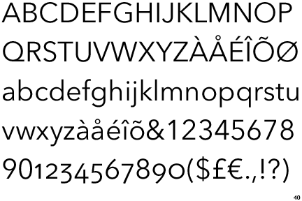
For the font choices I firstly decided that I would choose two different font families that I could use, one for and sort of Title/Heading/Important Info and one for the majority of text. For the title font I had to choose something of which would go with the heavy and thick nature of my font and seen as one of my favourite fonts at the moment worked perfectly with it I decided to use Gotham bold. Its sans-serif and bold/heavy nature both fits perfectly with my font as it gives off a clean and sleek look and a sense of structure. The next task was to choose a body copy text of which would fit well with the logo and the typeface already chosen. After a lot of nothing but trial and error I decided to use Avenir next, the main reason for the choosing of this font was the fact that It quite suited well matched with gotham bold as they are both fonts with smaller x heights of which makes them both quite rounded compared to most fonts.
Finally the last aspect I had to decide on before creating the business card was what colour choices I would use for my branding colour pallet, I decided that the colour I chose for my branding I wanted to be both calm and quite neutral. I decided on this as I believe these neutral colours are what is the expected and what goes very well with the classy elegant and professional style of design i was going for and also the fact that I don't want the prospective clients to think I specialise in certain colours so therefore so that I could still include colour in my branding as I wanted a neutral colour was the best Idea. So therefore to accompany the black and white after more trial and error I decided upon using two different cream shades, a darker and a lighter one.
 
Now that all of this was decided It them meant it was tim to put together my final business card and here it is. For my final business card I made a strict grid structure that my business card would all be designed around top ensure that it remains professional looking. After trial and error with placements of the aspects of my business card and addition of other needed information my business card was finished. As a little extra addition to my cards I planned to de-boss a scaled up version of my logo on the card so that it would be only slightly apparent by view and not overly in your face but due to met lack of time and resources to do this with I decided instead to include this scaled up logo into my card by using the slightly darker cream colour so that It gave the aesthetic effect of a de-bossing causing shadow on the original colour but it meant it would have the extra sense of touch to it. If I would have had more time I would have definitely de-bossed this up scaled logo.Finally I then applied my logo, colour pallet and font choices for my self branding on to a photoshop collateral document so that I could see what the finalised branding would look like in a real life situation.

I am really happy with my final branding for this module as this is something I have wanted to do for a very long time and now it is done and I am very happy with it. There are a few little things I would change like the addition of something to make my business card stand out more such as de-bossing if I had more time but I am very happy with how it has gone.
|
No comments:
Post a Comment